
First impressions are crucial, both in personal and professional realms. Because logos are typically seen as representative of a company’s goals and mission, maintaining one that leaves a lasting impression is essential. That being said, many of today’s most recognized logos are the result of numerous updates. The question is, what reasons did the companies represented by those logos have for rebranding?
Memorability
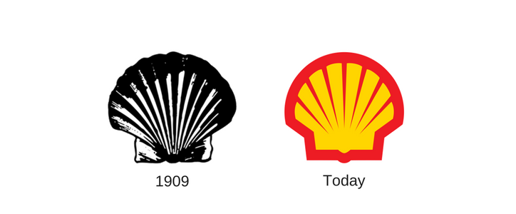
Some companies rebrand to make their images more memorable for consumers. Shell, the multinational oil and gas company, has undergone several rebranding efforts since introducing its initial logo in 1901. The first Shell logo depicted a simple mussel shell in black and white. Today, the logo has a clean, crisp shell vibrantly colored in yellow and red—a design that is so recognizable that Shell often displays it without the company’s name. Shell also proves that there’s no reason to change what’s working; the company has used its current logo since the 1990s.
Company Values Alignment
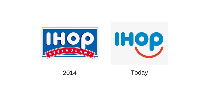
Another reason that companies update their logos is to better represent their business values. For example, in 2015 the International House of Pancakes (IHOP) changed its logo for the first time in more than twenty years. IHOP felt its previous logo appeared low spirited and wanted to better reflect the company’s promise to make customers smile. By changing the logo to include a smile within its name, IHOP portrays the impression that guests will feel happy while eating in its restaurants. The new logo now links good food and good spirits to the IHOP name.
Represent Company Products
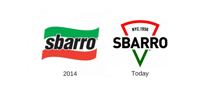
In some cases, companies update their logos to better represent their products and services in their branding. That was the intention when the Sbarro pizza chain began rebranding efforts in 2015. Previously, the company’s logo included its name in front of an Italian flag. Now the Sbarro name dissects the outline of a pizza slice, forming a logo that effectively showcases the chain’s main product offering. In addition, the company added “NYC.1956” to its logo to reflect its Brooklyn heritage.
Change Is Good
For a company to survive and grow, its marketing must evolve to reflect business changes. Whether it’s done to make your company more memorable, highlight your corporate values, or promote your product offerings, updating your logo is a surefire way to set your business apart from the competition.