
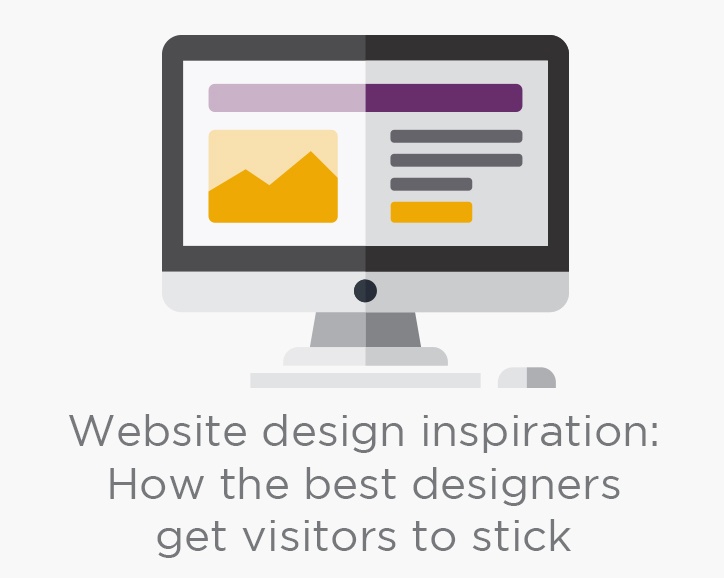
Conventional wisdom says that website designers must convey a company’s entire story in just a few seconds, lest visitors get bored and move along to another site. Assuming—for the sake of argument—that your business is too interesting to sum up in seven seconds, a designer would need to find ways to persuade visitors to stick around long enough to discover all you have to offer.
Today’s best website designers blend information with compelling design to create sticky websites that engage readers. As a result, the race is not to tell your entire story fast, but to quickly capture your visitors’ attention so you can tell it properly.
We’ve found ten websites using modern design techniques that encourage visitors to explore at a leisurely pace, thereby improving the average amount of time people spend on their sites. Take a look—and take your time.
1. Pocket Penguins
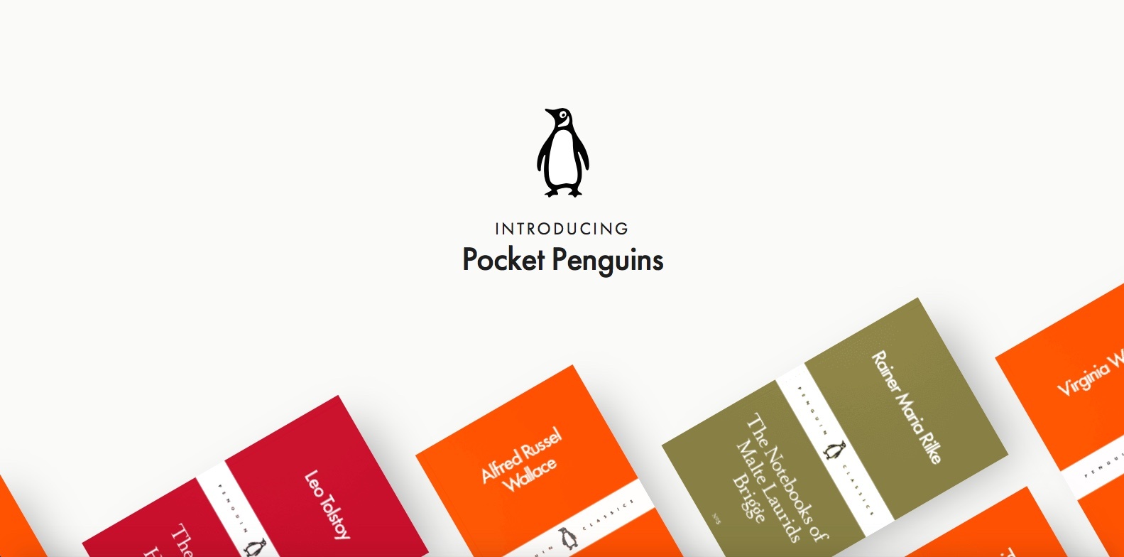
It’s hard to miss the bright, colorful graphics—set off against ample white space—on the Pocket Penguins book website. The site promotes a series of classic paperback books reprinted from the Penguin archives. Look closely and you’ll notice a color scheme: books originally published in English have orange covers, Russian books red, and so on.
What’s not so obvious is the lack of a navigation menu. Scrolling is the site’s primary form of navigation. And the more you scroll, the more enticing the site becomes, until you reach book quotes that lead you to longer excerpts and buying details.
Leave it to a book company to design a website without a table of contents—and a layout that’s as enjoyable as perusing your favorite bookstore.
2. Sagmeister & Walsh
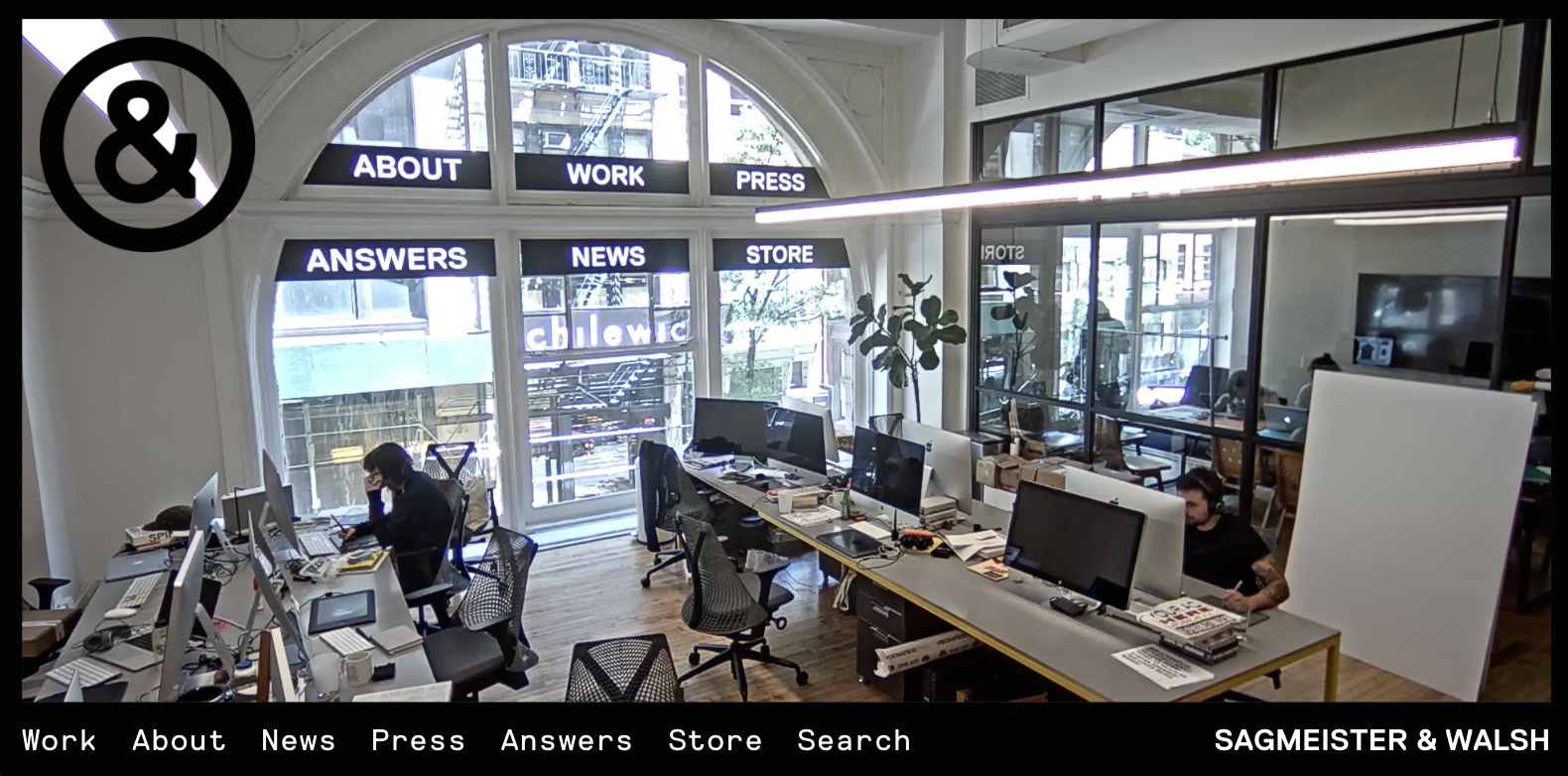
Sagmeister & Walsh is a full service design studio located in New York City. Arriving at their website, one is immediately tempted to scroll down and view the beautifully displayed work portfolio filling most of the home page. However, take a longer look at the workroom photo at the top of the page. It’s actually a live feed of S&W’s workspace—complete with designers at their desks, meetings taking place in the conference room, and traffic passing outside the windows. Notice that the window graphics serve as links to the site’s other pages.
You might think the company’s staff would find the live feed intrusive. But S&W is somewhat famous for publishing seminude photos of its team. Apparently, self-consciousness is a nonissue there.
3. BUNDY BUNDY
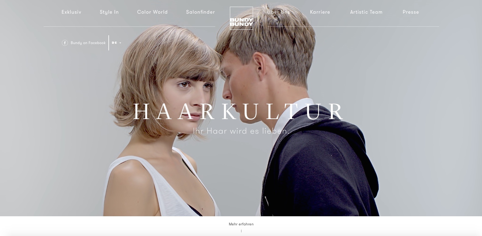
The website of Vienna hairdressers BUNDY BUNDY incorporates subtle homepage animation to get visitors to look twice. For example, notice the female model’s shifting eyes in the hero photo. The site also features video and sound on secondary pages as they load. The site is as edgy as the studio’s popular hairstyles.
Ihr Haar wird es lieben, claims the company (Your hair will love it). So, too, will your imagination.
4. HireLevel
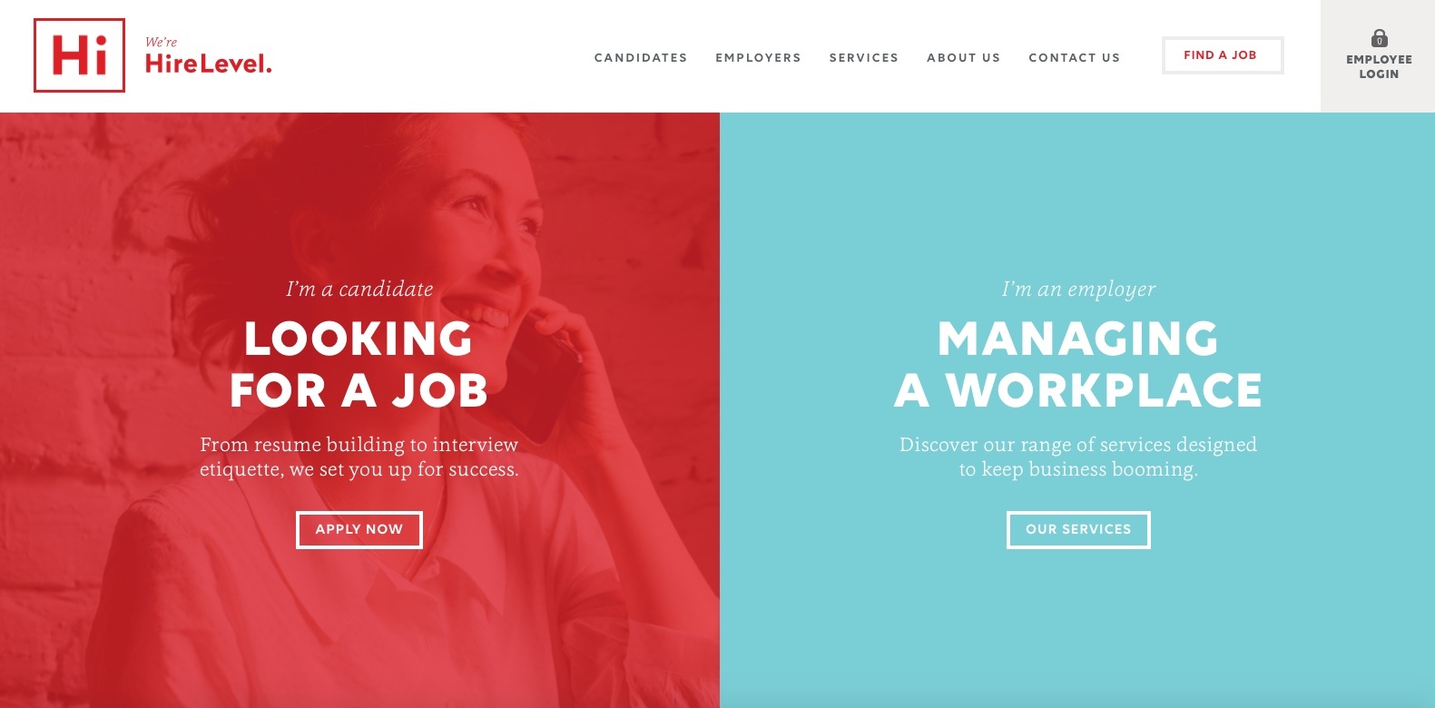
Staffing and recruitment agency HireLevel employs an extensive but well-coordinated color pallet throughout its website. Featured colors match outfits worn by the HireLevel employees who appear in the site’s photos, creating a skillfully organized look and feel. Large text, plenty of white space, and bold graphics make the site especially inviting, and before you know it, you’re engrossed in its content.
Whether you’re looking for a job, or looking for job candidates, this website is wonderfully engaging. Your HR department should look this good.
5. Nurtured Digital
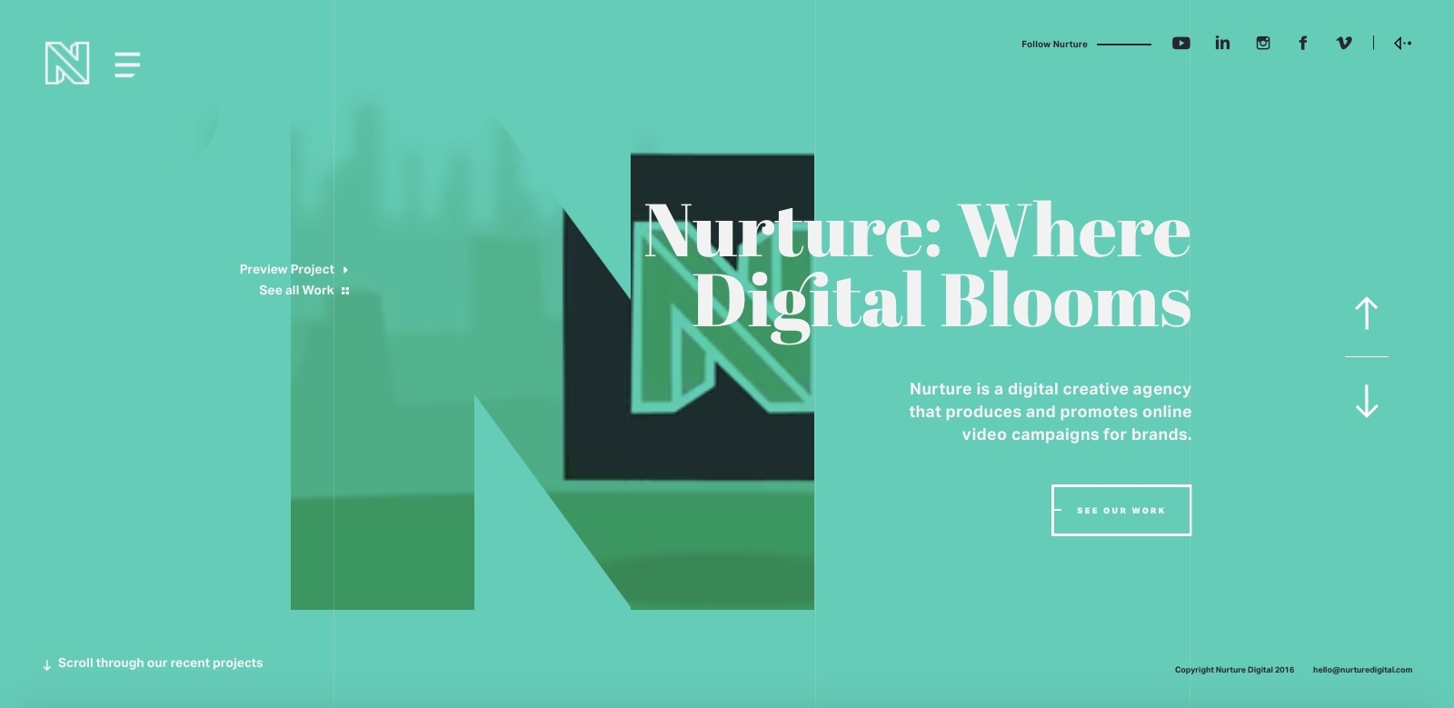
Culver City, California’s Nurtured Digital spells out its design approach through some cleverly placed homepage videos; images of the company’s work appear behind large cutouts as the letters in Nurtured appear one by one. Full-page colors, large text, and a giant round cursor make for a particularly appealing page.
The website uses scrolling in a unique way. Instead of the usual downward movement effect, scrolling on the Nurtured site causes pages to slide in from various directions. Also note how the navigation menu expands to include descriptions of each page.
Be sure to click on the View Case Study links; you won’t want to miss the beautiful presentations of Nurtured’s work.
6. Plane—Site
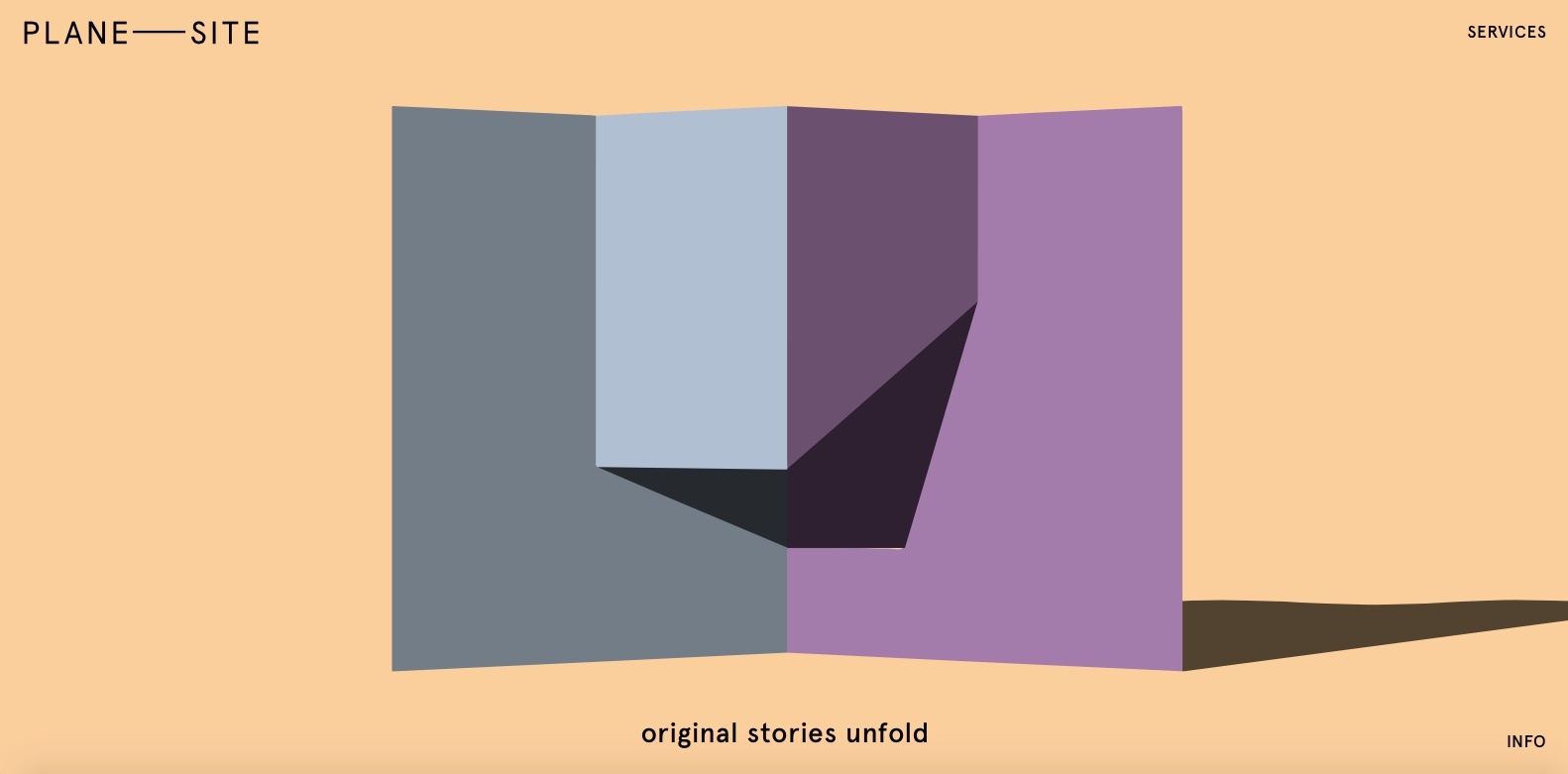
Berlin-based digital agency Plane—Site also incorporates alternative page transitions into its soothingly colorful website. Spend the extra time scrolling through the stunning 3D-shape animations on the homepage. The site contains a nifty sidebar navigation menu that responses when you scroll.
There’s a lot to read, but the site is so cool, you won’t mind hanging out for a while.
7. Raden
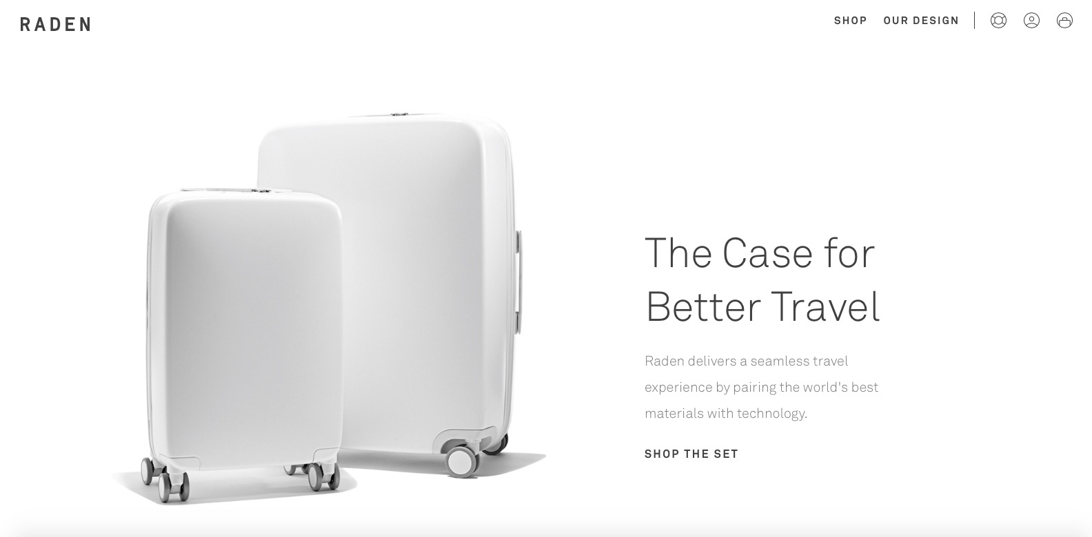
Raden wants to eliminate some of the hassles inherent in traveling. In the process, it is improving the online shopping experience as well.
The company makes two smart suitcases that come equipped with travel-easing technology built in, including two electronic device chargers, an integrated scale that monitors the bag’s weight (no more extra fees at check-in), and proximity sensors to help you track your bag’s whereabouts. All this is beautifully explained using large images and easy-to-read text.
Raden claims its suitcase design is rooted in all things simple, smooth, and smart. That certainly holds true for their website.
8. We Love Noise
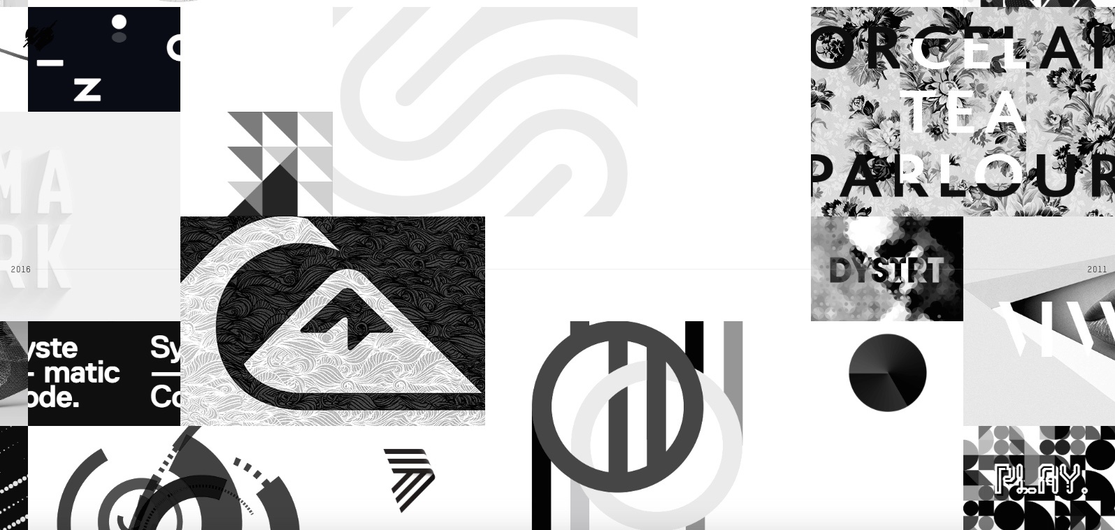
We Love Noise is the website of Luke Finch, a multi-disciplinary art director from Manchester, U.K., who is currently working in San Francisco. As he does with his art, Finch takes an experimental approach to showcasing his work. A collage of images stretched across a timeline provides links to Finch’s extensive design portfolio.
Finch’s presentation of his work is as beautiful as the work itself. Visitors will find it hard to tear themselves away from their screens.
9. Holm Marcher & Co.
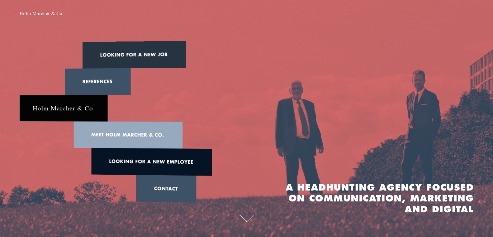
Copenhagen-based Holm Marcher & Co. is a recruitment firm specializing in marketing, communication, and digital candidates. The company’s site features large tinted photos of its principals, big bold text, and a color scheme that pops without offending. Posted jobs are shown, not in a list, but in a collection of colored text boxes—the same concept that’s used for its navigation menu.
Holm Marcher appears to know its stuff, at least when it comes to hiring qualified website designers.
10. The Cupping Room – Australia
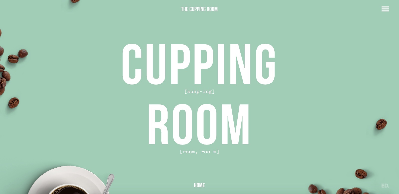
The Cupping Room is a hip, airy cafe in Canberra, Australia that serves boutique coffee and tea. Their website serves its contents with a clicking-scrolling hybrid approach. Hover near the current page title listed at the bottom of the page, and a downward arrow encourages you to click to summon the next digital course. After a while, you get used to moving the cursor around to see where the next arrow pops us, and which direction to go next.
Of course, you could just click on the condensed menu at the top and use the expanded page listing. But where’s the mystery in that?