

Companies decide to rebrand their iconic looks for various reasons. A struggling company might rebrand in an attempt to stay afloat. An outdated logo could need refreshing. Or maybe, a company has expanded its services and needs a logo to reflect that expansion. No matter the reason, a rebrand is a high-risk, high-reward move. So, it’s news when three popular names take steps to refresh their brands.
Sears
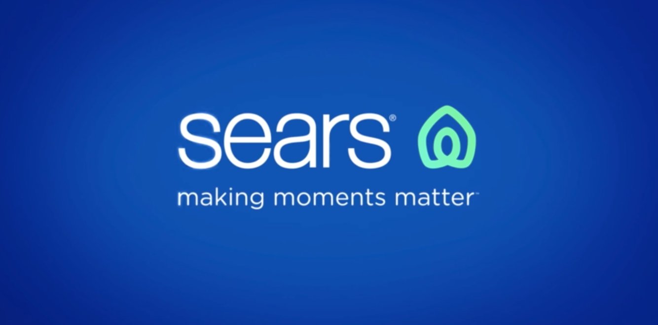
Once a retail giant, Sears has fallen from grace in recent years. The retail store once revolutionized the industry with innovations such as the shopping catalog and Discover credit card. However, after newer big-box stores entered the marketplace and online shopping invaded the retail sector, Sears suffered a decline. In October 2018, Sears filed for bankruptcy in an attempt to save the company.
Nearly one year later, the company—looking to make a comeback—introduced a new logo. The refreshed logo—which many have compared to the Airbnb logo— features a design Sears says represents both “home and heart.” They also unveiled a new tagline, “Making moments matter.” Only time will tell what impact the rebranding will have on this former retail behemoth.
Firefox
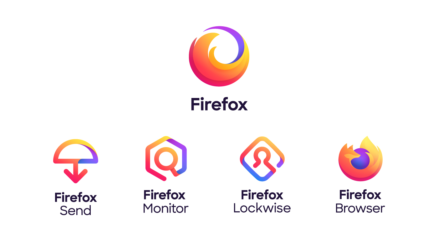
Mozilla Firefox is primarily known as an internet browser. But now the company is evolving to be much more than that. Firefox is expanding its services to include programs such as password management, file-sharing, and hacking notification. The company’s product expansion provides an opportunity to tweak their logo.
Firefox revealed logos for all of their services and one for the brand as a whole. The logos feature the colors orange, yellow, purple, pink, and blue in the trendy gradient use.
Ikea
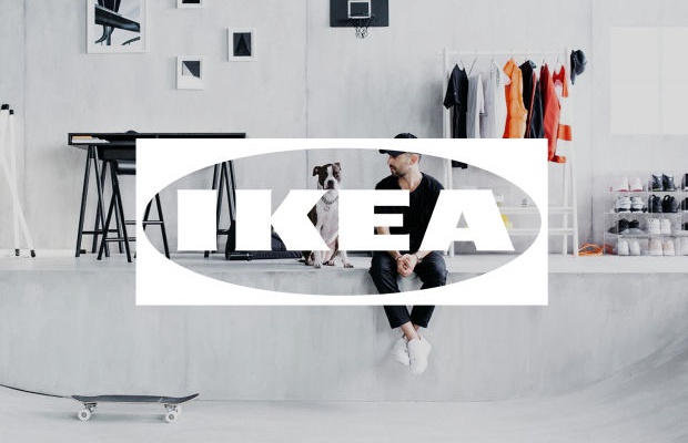
Careful consideration is needed when rebranding a logo to determine how it will look on various social media platforms and in digital ads. A simple modification to a logo can significantly benefit a company’s online presence with consumers.
Furniture retailer Ikea has shifted its focus to embracing the digital world. Ikea exchanged their iconic blue and yellow colors for white in online advertising. The more flexible image creates a “window” effect, allowing the picture behind the logo to remain visible. Ikea, who will also use the original logo, hopes the white version will allow for more creative uses on digital platforms.