When launching startups, entrepreneurs tend to get involved in every aspect of their new businesses. Not surprisingly, that includes influencing their companies’ logo designs. And, more often than not, business owners allow their personal preferences to affect design decisions, rather than employing proven practices that work.
So, if you’re involved in creating a new logo, we’ve compiled a list of popular trends to inspire you. The styles shown can help make your logo both beautiful and effective.
1. Negative Space
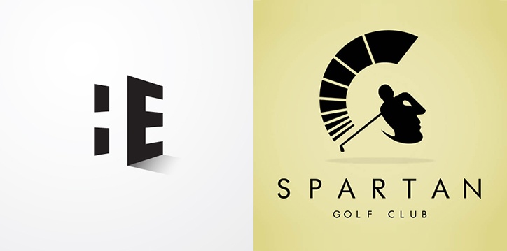
Negative space gives a logo an intricate, clever effect that causes viewers to take a second look. The term refers to the space in or around an object that intentionally forms another shape within the design. Results are minimalistic and truly striking—and get people thinking about your logo.
Filipino designer Harvey Esparcia uses negative space to combine his initials and form a simple but elegant logo. At first glance, the logo for Spartan Golf Club features a golfer who has just finished his swing; but look again and you’ll also see the profile of a Spartan warrior.
2. Rearranged and Stacked Words
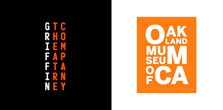
Word marks, or logotypes, incorporate design around a company’s name. Traditionally, the only creativity needed when designing a word mark was choosing an unusual font. But nowadays designers are playfully rearranging the way words appear—making up syllables and stacking the results—to create balanced and compact logos. The trend is especially useful for reducing the space required for long or wordy business names.
Notice how Griffin Theatre Company mimics a theater’s seating chart with its name. Alternatively, the Oakland Museum of California stacks the letters of its lengthy name into three sections, while emphasizing its OMCA initials.
3. Hand-drawn Appearance
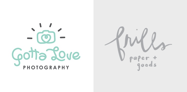
While not technically drawn by hand, so-called “handmade” logos give an appearance of a free-form sketch. The look adds a quirky casualness that’s popular with local and trendy businesses.
Gotta Love Photography blends hand-drawn imagery with the printed word “photography” to produce a cheery logo. Frills Paper & Goods uses a handwritten look to create a unique word mark.
4. Using Circles

While designers introduce more and more shapes to logo design—from curves and swirls to dog-eared squares—the circle remains a geometrical staple. Whether encompassing the company name (i.e., Coca Cola, Texaco) or appearing next to it (Target, Asana), circles provide perfect visual central points.
USA Today replaced its logo’s shaded globe with a large blue circle. Open Table uses a circle to symbolize a tabletop; a hole cut from the middle turns the tabletop into the initial O (see Negative Space above) and is placed alongside to represent a diner.
5. Corners
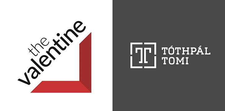
An alternative to a circle is a rectangle. Symbolic of the way we frame our work, the four-cornered shape draws our eyes to the words that lay within. What better than a corner, with or without the rest of a rectangle, to contain our branding message?
The Valentine uses two mitered sides to form the cornerstone of its logo and, at the same time, to create the letter V. For its logo, Tothpal Tomi Photography outlines adjoining Ts with four separate corners.
6. Retro/Vintage
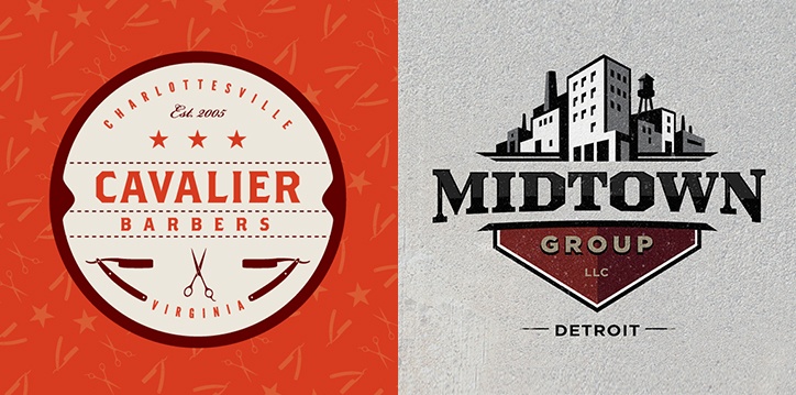
Vintage logos combine today’s flatter designs with nostalgic looks—perfect for making your spanking new brand seem well established.
Cavalier Barbers has a classic looking crest-style logo that reflects a simpler era when barbershops served as neighborhood gathering places. Midtown Group’s logo ties nicely into hometown Detroit’s current manufacturing renaissance.

